The 2-dimensional plots that I've been using (and most of us have been using) are actually more of a snap shot of this. The downside of 2-D plots is of course you need to make compromise. Arbitrary decisions.
For example, consider a simple linear model with a 2-way multiplicative interaction term,
f = xb1 + yb2 + xyb3 + e,
where both x and y are continuous variable.
To present a `marginal effect' of x, that is x's effect on f conditional on y, one need to take a certain difference value (most typically dy/dx). Then you make the case that `when 1 unit changes in x, f changes this much where y values are such and such'. This assumes that x's effect on f is strictly linear: it doesn't matter the change in x we are assuming in the 2d marginal effect figure is from 1 to 2 or 101 to 102. dy/dx assumes it's essentially the same 1-unit change.
Most often, of course, this isn't very realistic. I mean, think of diminishing marginal returns.
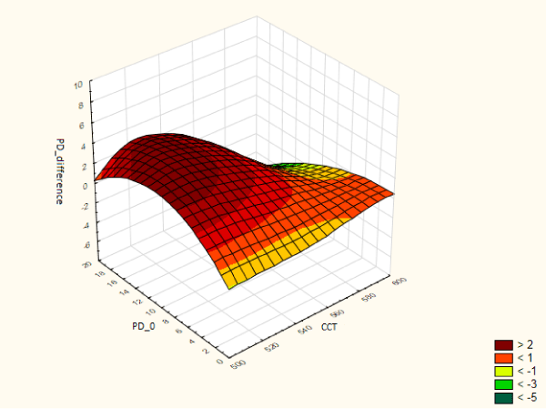
One needs to show the whole picture of the structure between f, x, and y just like the picture above to fully explain their relationship.
I know Matlab does it pretty well. Indeed the picture above is generated by Matlab (I believe). But I don't want to learn another package.
Stata has some functions and I tried them today.
One was _graph3d_.
The logic is simply: you have x y and z variables and locate each data point based on them.
The picture I ended up having using my exchange rate regime choice data, though, looks ugly as hell.
This isn't no post-estimation command but I used it as though it was (using predicted values of the DV).

What could've been most useful would be 3d equivalent of _marginsplot_.
Another option, which I see more often these days, is _gr twoway contour_. It should generate something like this:
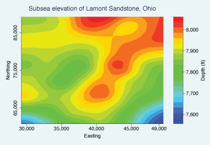
The figure surely does take into account multi-dimensional variation of data and in some ways much more effective in doing that than 3-d graphs do. It took, however, forever for my macbook pro to generate this with my data (obs=1,510). I needed to go back and forth quite a bit, and if I need to spend an hour every time, this isn't feasible.
-surface- was the third one that I tried. It seemed to have all the same problems that _graph3d_ had. More importantly, it approximates the values when the variable is continuous.
So I gave up there. Spending more than a whole afternoon on a marginally fancy graph that I may or may not use for the paper I'm working on is just insane, I thought.
For now, I would just show two dy/dxs: 1) x's marginal effect conditional on y and 2) y's marginal effect conditional on x.
No comments:
Post a Comment